
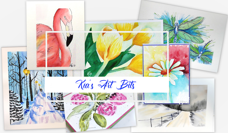
Hello all. I have done these cards for Scrap'n Stamp Canada, but in my haste I failed to add the correct watermark! Welcome to Day 19 of the Random Act of Cardness for July 2021. My word for today is Rainbow, and the cards I created all have Rainbows, but they are not a standard Rainbow.
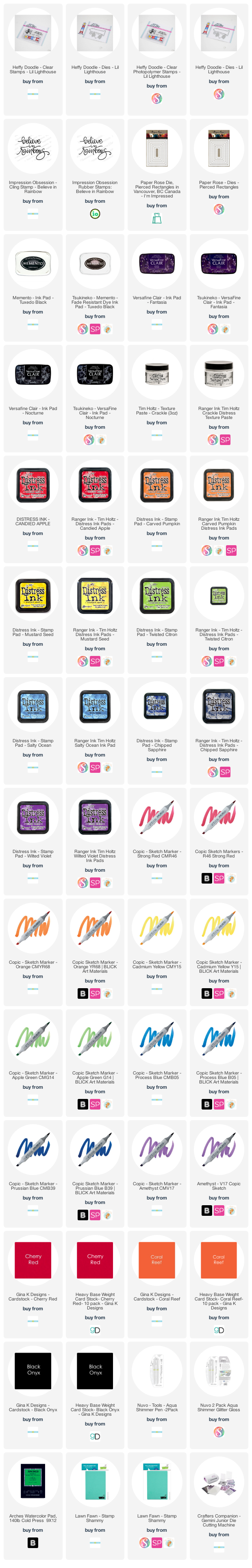
As the colours of a Rainbow are beautiful I wanted to show how you can use colours of the rainbow in different ways. I have used a Picket Fence stencil, a small Lighthouse Stamp Set from Heffy Doodle and a favourite sentiment from Impression Obsession.

For this card I am using a stencil along with Distress Texture Paste, Crackle. First I secured the stencil over my card base, which is Neenah Classic Crest Solar White card, and applied the texture paste to a selected area.
Once the paste was dry using the small brushes from my Life Changing Brushes I applied distress ink to the leaves selected following the rainbow colours, being Candied Apple, Carved Pumpkin, Mustard Seed, Twisted Citron, Salty Ocean, Chipped Sapphire and Wilted Violet.
Once everything was dry I added splatters using the distress inks in the red, yellow and violet. I then stamped the sentiment using VersaFine Clair ink in Fantasia.
Next up a Clean and Simple card again using colours of the rainbow which I did using the Pointillism technique and Copic markers. Pointillism is a painting technique developed in the mid 1800's and involves using small, painted dots to create areas of colour that together form a pattern or picture. It is also informally known as dot art or stippling art.
I wanted the yellow at the top of the lighthouse, so adjusted the colours accordingly. I also coloured in the light area and the windows using the yellow, and the door using the red. The sentiment is stamped using VersaFine Clair ink in Nocturne.
Copic coloured lines drawn using tape to measure, which makes it easy to do. And yes, I deliberately attached my panel showing the colours in reverse. The only reason for doing so is that I liked the look better this way, than starting with the red on the left side. Its a crafters prerogative!
Once I was done with the colour I stamped the lighthouse and sentiment using Memento Ink in Tuxedo Black. I die cut the piece using my Pierced Rectangle die from Paper Rose and matted with orange card along with a die cut red card.
I also like the Lighthouse on the right side rather than the left. Don't ask me why, it must be because I am right handed. To me, it feels more balanced. Anyway, I digress. I like the Lighthouse over the lighter colours too.
We have reached my final card for today's post. Here I used distress inks and Arches cold press watercolour paper to watercolour my Rainbow. As I painted the rainbow I made sure I was connecting to the colour above, which allowed for some bloom to happen. This adds further interest.
This is the closest I came to an actual Rainbow. Again I stamped using the Heffy Doodle Lighthouse Stamp set. It does not show in the picture unfortunately but I have glimmer gloss on the Lighthouse, which looks very pretty in real life!
I hope you have enjoyed this post today.


0 comments
Thank you very much for commenting. I love to read what you have to say and appreciate the time you take. I monitor comments to keep those spammers out, so do not be surprised if you do not see your comment straight away.